The Problem?
The current landscape of ticket booking apps often feels clunky, overwhelming, or just plain meh.
Users struggle with:
1. Limited event discovery features.
2. Overwhelming or unclear event details.
3. Slow, multi-step checkout flows
4. Lack of intuitive ticket management.
Goal
Design a mobile-first solution that empowers users to:
1. Effortlessly discover live music events based on their interests.
2. View essential event info at a glance.
3. Breeze through ticket selection and checkout.
4. Manage their tickets (and excitement) all in one place.
For this concept project, I initially created two personas to represent distinct user groups.
However, after evaluating both, I decided to focus on a single persona as it best represented the core target audience.
Her need for a quick, mobile-first experience and frustration with complicated checkouts aligned with the app’s main challenges. Focusing on this persona allowed me to streamline the design and address the most relevant pain points effectively.
Prioritization
Given the project’s four-week timeline, I used an Impact-Effort Matrix to prioritize features strategically.
This approach allowed me to focus on delivering high-value functionality while ensuring efficient use of resources.
By balancing user needs with time constraints, I could create a solution that was both impactful and feasible within the given timeframe
Wireframes & Usability testing
Inclusivity was central to the design, adhering to WCAG 2.1 guidelines:
Perceivable: Achieved a color contrast ratio of 10.16:1, exceeding accessibility standards for readability. Added alt text to icons and images for screen reader compatibility.
Operable: Designed interactive elements with ample size and spacing for touch and keyboard navigation.
Understandable: Used clear labels and intuitive workflows to support users with diverse abilities.
Robust: Ensured compatibility across devices and assistive technologies, including screen readers and magnifiers.
Clarity drives action
Reducing cognitive load—from the home screen to checkout—helped users make quicker, more confident decisions.
User feedback is gold
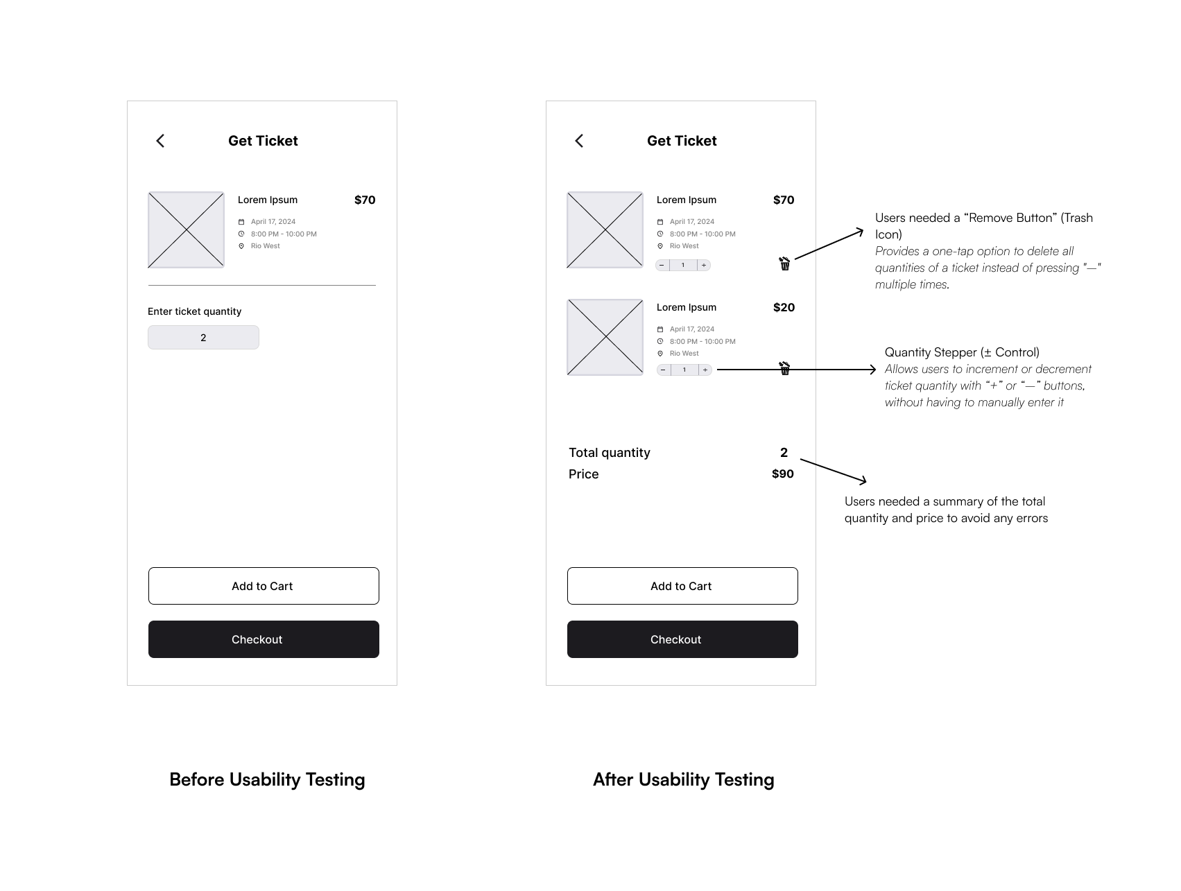
Every usability session uncovered small friction points that led to meaningful design improvements.
Empowerment builds trust
Giving users clear control—like adjusting ticket quantities or favoriting events—created a more intuitive and flexible experience.
Less really is more
Simplifying interactions and focusing on essential actions kept the experience streamlined without sacrificing delight.